Sunday, May 4, 2014

Doppler radar Maps!


This is a doppler radar map.  This is vital in weather forecasting today.  It displays a shift in speed of a moving object and can track through different altitudes.  This is a map of a storm as it moves over Alaska!
    
URL: http://t0.gstatic.com/images?q=tbn:ANd9GcQXihqwTOFTHWhtv0CqlS8EhaTTNBZeXWydvt2OQm7Hh8U6SIXegKktvaiq

Black and white Aerial photography!


This is an example of black and white aerial photography.  This kind of map is a form of remote sensing in black and white.  This aerial imagery allows us to examine large areas of land in a variety of different resolutions!
    
URL: https://blogger.googleusercontent.com/img/b/R29vZ2xl/AVvXsEgdS95WQvNGm-6_duh65JAO8ZQBbeMsSxVmlNtWXwzZcnJ_Cb1OCasUO2uEWPjGusYLtdbq9mBWNXxalrCIw1yEdux5P8fCZEXtd-DBsBNkYxqMAZszHP0WY19AfwNTDU0ieYx4Di_2rDA/s1600/infrared.jpg

Infrared Aerial Photos!


This is a infrared aerial photo.  Infrared photos are useful in determining the health of vegetation and bodies of water.  This picture shows background infrared emitted by the ground and plants!
    
URL: https://blogger.googleusercontent.com/img/b/R29vZ2xl/AVvXsEgdS95WQvNGm-6_duh65JAO8ZQBbeMsSxVmlNtWXwzZcnJ_Cb1OCasUO2uEWPjGusYLtdbq9mBWNXxalrCIw1yEdux5P8fCZEXtd-DBsBNkYxqMAZszHP0WY19AfwNTDU0ieYx4Di_2rDA/s1600/infrared.jpg

Cartographic Animations!


This map is a cartographic animation.  These maps are a very engaging way of displaying geographic data.  Having a moving source of information can show things that are not apparent with static images.  The image above is a loop of Hurricane Katrina.  This is useful because we can make predictions based on the storms movement!
    
URL: http://www.rawstory.com/rs/wp-content/uploads/2012/08/tumblr_m62v32dr9I1rv0tmto1_500.gif

Statistical Maps!


This map is a statistical map.  These maps suffer heavily from the modifiable areal unit problem.  They show statistical data plotted on geographical areas.  The above map shows forest prevalence in western Europe!
    
URL: http://www.efi.int/files/images/virtual_library/jrc_map.png

Cartograms!


This map is a cartogram.  Cartograms are maps that distort the land area of locations to display the selected data.  This cartogram is an example of an ethnic cartogram, showing the worlds population of Jewish people!
    
URL: http://www.worldmapper.org/images/largepng/563.png

Flow Maps!


The map above is a flow map.  These are maps that simply graphically show movement from one place elsewhere.  They show packet flow, migration, movement of goods, military movements, etc.  The map above shows the flow of French wine exports!
    
URL: http://www.datavisualization.ch/wp-content/uploads/2009/07/flow_map_01.png

Isolines!


This is a isoline map.  Isolines are lines where the value of the data it represents are constant along the length of the line.  Isolines representing different variables have other names and so do other maps that use these maps.  The map above shows different areas with different amounts of precipitation in Washington.

URL: https://blogger.googleusercontent.com/img/b/R29vZ2xl/AVvXsEibvPLM3q65xh5Yh8RPixbaWOjcbdLgJsYFlEi1FNh7pYzsVN9Q6KNHx-IMGFhlLldq7mIV2M79y5PzCwFwFKa39pA4GfXzFQ2STBlYxeeSe5YZWkkhG2wlEiRUeZUuRj9je8vXOHKS2Y_0/s1600/wash-precip.gif

Proportional Circle Maps!


Above is a proportional circle map.  These maps use circles to display numerical data, with larger circles meaning larger values and vice versa.  They are useful for quickly comparing different areas with different values for any given variable.  This map shows the number of internet users in Europe!

URL: https://blogger.googleusercontent.com/img/b/R29vZ2xl/AVvXsEh07QDhFjstiVjvuRoxArft4hJMNk_B-rQ38OWFvHmOYvjGSibaQG1YRMtBICbTfUoODMXMW5LgzwSDIP1_kVkGwo6vxcm7L6RUM1Jewpo5YPNkGtGyCbC_Xj9uVPphUQPSC_T3ofFfxVU/s1600/standardized+c+map.PNG

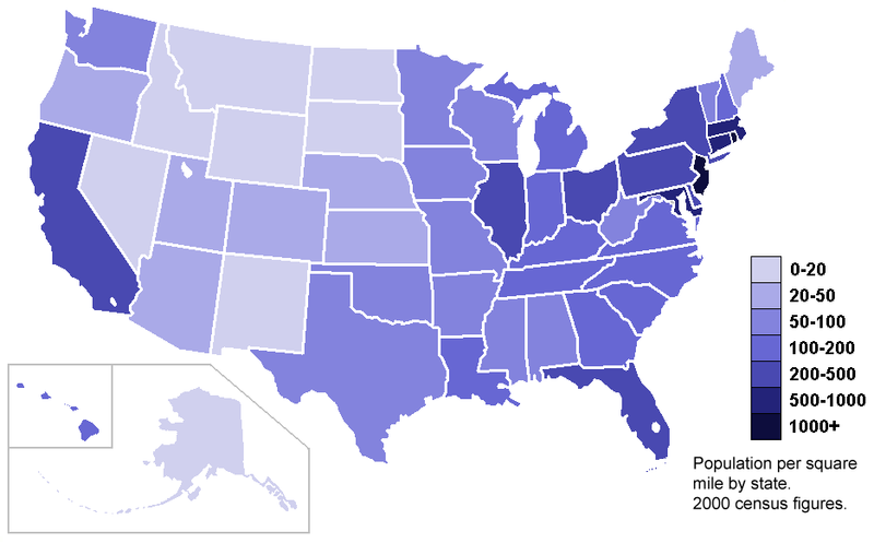
Standardized Choropleth Maps!


Here is an example of a standardized choropleth map, where data is averaged according to land area.  This is useful because of how maps can be skewed because of the modifiable area unit problem.  These maps are commonly used to show population over area like the map above which shows this data for the US.  

URL: https://blogger.googleusercontent.com/img/b/R29vZ2xl/AVvXsEh07QDhFjstiVjvuRoxArft4hJMNk_B-rQ38OWFvHmOYvjGSibaQG1YRMtBICbTfUoODMXMW5LgzwSDIP1_kVkGwo6vxcm7L6RUM1Jewpo5YPNkGtGyCbC_Xj9uVPphUQPSC_T3ofFfxVU/s1600/standardized+c+map.PNG

Dot Distribution Maps!


This is a dot distribution map.  These maps are used to show density values of data and can be useful for showing patterns in the data.  The above map shows population density in New Jersey and shows a high density in the north east of the state.    

URL: https://blogger.googleusercontent.com/img/b/R29vZ2xl/AVvXsEj6-v0B1Z18F8fzYzpiPWgr8AKCdaH1jyYEogzr_TS54TLoehJurnw79Vr2a2I5HGWfeRvlyFfbyQg6DZf0dYuc1GHxqsig2IDhxa4uUwWAYPZgno4N4hnfUybFGYqTkCHUYYKU5kgX_UnK/s1600/dots.jpg

Propaganda Maps!


This is an example of a propaganda map.  Propaganda maps are maps whose purpose is to influence and sway opinion on political matters.  Countries, newspapers, textbooks, etc can all use these maps to discredit enemies or boost their image.  The use of symbols to convey a political message is common.  The above map shows Korea poised as a tiger clawing at China.  This depiction can lead the viewer to see Korea as a threat to China, or perhaps an economic rival.  
URL: https://blogger.googleusercontent.com/img/b/R29vZ2xl/AVvXsEgA5y5slpagOdSOxfv8nmT_TWN3i1qX8RWPVL8suAYEwUkf7AB-keXm5mo8sxzEg_IBkckgVwuD8aKYa2QXN8OzSR5lEYvBvXs5C-ykmxoiGLOwTlnlWM1iSza7-aRsw55q8iY5Dx2LyJcm/s400/7.jpg

Hypsometric Maps!


Here is a hypsometric map of the moon.  Hypsometric maps are maps that show changes in elevation via color.  The transition from color to color makes it easy to understand and visualize elevation and physical features such as hills or depressions.  The above map from Google shows how varied the moons surface is and some of it's distinct features!

URL: http://www.nasa.gov/centers/ames/images/content/368631main_elevation-map.jpg

PLSS Maps!


Above is an example of a Public Land Survey System map.  These maps are found in the United States, and are used to record land parcels that are undeveloped and ease future ownership.  The equal divisions of the land make it easy to manage and understand.  Most of the maps were made in the early 1900's.  this map is in Minnesota in the Worthington Quadrangle.  
URL: http://www.fairview-industries.com/standardmodule/mn-exmp2.gif

Cadastral maps!


This is a cadastral map.  Cadastral maps are representations of property ownership.  They allow us to understand and accurately determine boundaries between the properties of different owners, mitigating boundary disputes between neighbors for example.  These maps were first used by the ancient Egyptians.  Modern maps often integrate information such as GPS coordinates to be highly accurate.  The above map is a cadaster of a market square in the Ukraine and is being used by researchers studying Jewish ownership of the stores here!  

URL: http://www.geshergalicia.org/wp-content/uploads/2011/02/BukachivtsiJewishMarketSquare.jpg

Mental Map!


Above is a mental map.  This map is based on an individuals perceptions and experiences.  People of different backgrounds often have wildly different renditions of the same area and this can tell us about that individual.  The above map is a interpretation of the world, and shows the drawers view of the globe!

URL: http://www.geog.ucsb.edu/mapsandsociety/slides/thematic/cartoons/mental_map_of_world_3_thmb.jpg